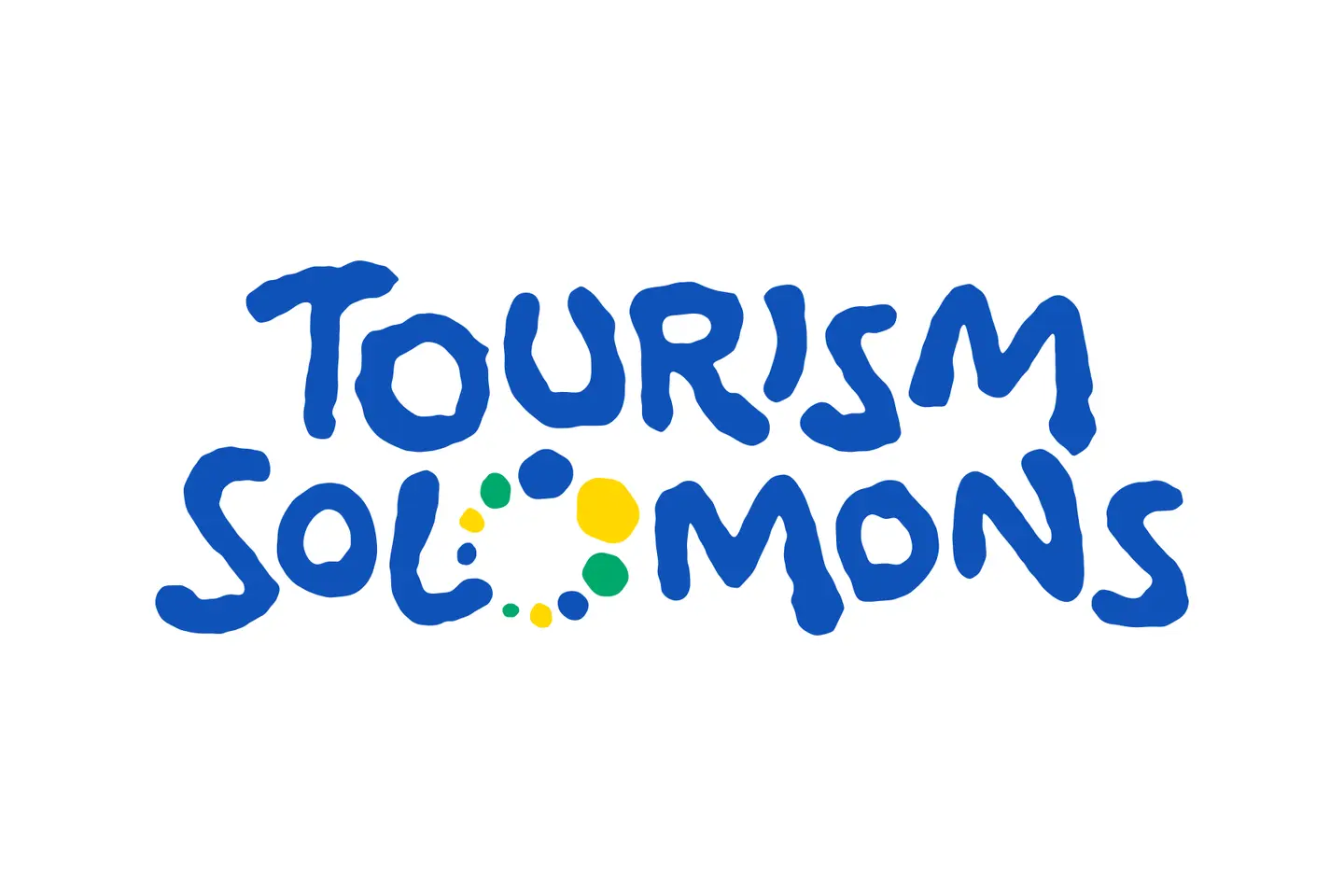
The dugout canoe that has stood for Solomon Islands tourism since 2018 is being retired. Tourism Solomons, the national tourism office, announced on 29 October a new logo and a new name for the way it presents the country to the world: Hapi Isles – Real, Rare, Raw.
The new logo spells "Tourism Solomons" in rounded blue letters. In place of one of the Os in "Solomons" sits a ring of nine small shapes, each meant to read as both an island and a shell: one for each of the nine provinces, and a nod to shell money, which Tourism Solomons said remains a living part of cultural exchange across the country.
The colours come from the national flag: blue for the sea, yellow for the sun and green for the islands' forests. The new look will be rolled out over the coming months with new marketing material, replacing the canoe logo and the "Solomon Is." theme launched in July 2018, when the Solomon Islands Visitors Bureau became Tourism Solomons.
The name itself is an old one. Hapi Isles is the Pijin form of "Happy Isles", the title of a 1965 book, The Happy Isles: A Diary of the Solomons, by Dick Horton, a British district officer who served on Isabel, Malaita and Guadalcanal and was a coastwatcher in the war. The young tourism industry of the time took the title up as a slogan, and Tourism Solomons said the phrase has since become part of everyday language.
Tourism Solomons chief executive Andrew Nihopara said the aim was to make clear what sets Solomon Islands apart from anywhere else.
"For too long, Solomon Islands has been viewed through a generic South Pacific lens, one that fails to capture its true character," he said.
"Solomon Islands' greatest tourism assets were never created for visitors – they exist because they have always been part of our everyday life, our culture, our communities and our natural environment."
He named diving and coral reefs, uncrowded surf breaks, trekking through rainforest and a culture still lived every day, and said what set the country apart was "not the scale of its tourism infrastructure or resort-driven development" but experiences that could not be found anywhere else in the South Pacific.
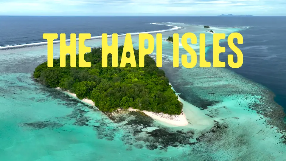
Over aerial shots of reefs and misty rainforest, the launch film opens with "Some places still have the power to surprise. Solomon Islands is one of them", then shows divers over a wreck ("Where history lies where it happened"), a carver, a bamboo band and dancers ("And culture is part of everyday life"), and a sandbank in an empty lagoon ("Where a whole lagoon can feel like yours").
The three words of the brand follow, each with its own line: "Real: living culture, lasting connections", "Rare: extraordinary places, few other footprints" and "Raw: nature in charge, adventure wide open". The film ends with three posters that play on the words of resort brochures: "Infinity pools" over snorkellers at Uepi in Marovo Lagoon, "Wireless connections" at Hotomai Cultural Village in Central Guadalcanal, and "Kids Club" with four children sitting in a tree at Roderick Bay on Nggela Sule.
The new identity was developed by Grin Creative, a Melbourne agency that also produces Solomon Airlines' in-flight magazine, after a brand review that Tourism Solomons said included consultation with the industry, research among travellers and a study of the destination.
Mr Nihopara said visitor numbers were "steadily returning towards pre-pandemic levels". Figures from the National Statistics Office show 27,329 visitors in 2025, up from 25,130 in 2024 and about 1,600 short of the 28,930 who came in 2019. From January to July this year 16,388 visitors arrived, 12 per cent more than in the same months last year, Tourism Solomons said, citing the statistics office.
"As travellers increasingly seek meaningful connections and authentic experiences over convenience and commercialisation, Solomon Islands is uniquely positioned to welcome those in search of something real," Mr Nihopara said.